

Colour Grading
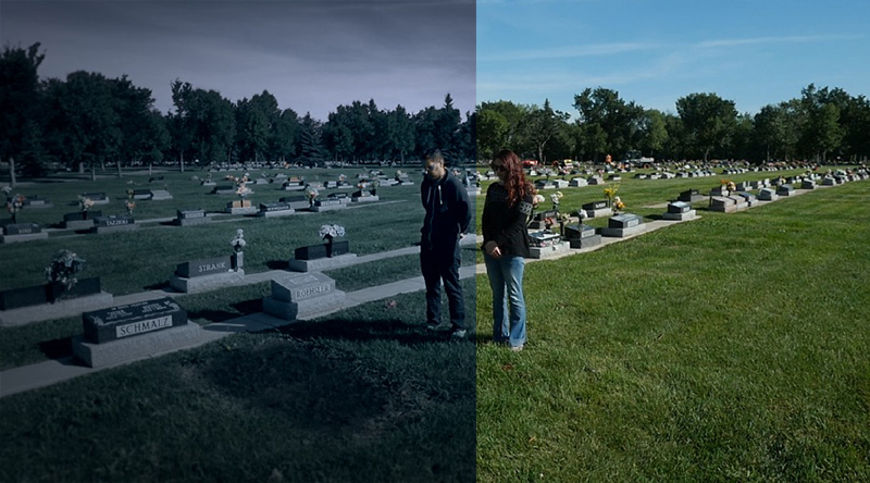
For the colour correction of our film opening it was done on Premiere Pro and we tried to aim for a eerie look by reducing saturation and increasing the intensity of the shadows in our shots, reducing bright light. We also used a preset effect Lumetri Colour(Cinespace 25) to help bring out a cinematic look.

Credit Sequence and fonts
For the processes leading to our final film opening product, one of the things we had to do was add the credits and full names of actors and producers(as the full name is not shown in the word cutouts as well as what do the people do)


I was in charge of adding the credits onto the film.
I used the opening credits of Westworld as a guide as I was drawn to the simplicity of the use of text and thought it would suit our film opening.
Then, we did some Font Research to see which font was the most suitable to be used in the credits. I found some that looked considerably fitting and showed them to Prima and Eye for approval, then downloaded the file and added it to my Fontbook on Mac, and tried it out on aftereffects with our magazine cut out clip as the base.
Here are a few that I downloaded from www.dafont.com and tried out.


However, after trying them all out in several different font sizes and composition, none of them looked right and both my group mates agreed.
I then switched to trying out default fonts that were already on the program and found that simplicity is key. It turned out that Times New Roman in capital worked best. The settings I used were font size 48 and 25, coloured white and opacity 45%.
Here is how it looked :

Title Change
After reading the feedback from peers, a common response was that our storyline was a bit confusing and many didn't understand what was going on.


Because we have not added in the title of our film yet, we decided to change our title to "Skin" so that it was clear to the audience that the plot and killer in this movie revolves around youth and skin. This fits in with our storyline well as a woman trying to stay youthful murders and uses victims' skin to look beautiful.
In addition, many people did not know what our original title "Limerence" meant so we decided to go for a simple and straight to the point film title.
During the lesson we then explored how the words of the titles would look compared to each other with different fonts.


Because we have not added in the title of our film yet, we decided to change our title to "Skin" so that it was clear to the audience that the plot and killer in this movie revolves around youth and skin. This fits in with our storyline well as a woman trying to stay youthful murders and uses victims' skin to look beautiful.
In addition, many people did not know what our original title "Limerence" meant so we decided to go for a simple and straight to the point film title.
During the lesson we then explored how the words of the titles would look compared to each other with different fonts.


Plans for Final Product
After reviewing the responses received about our rough cut, we came up with ideas on the steps we will take to reach our final product and the things we would change and improve as well as keep the same. Here are a list of changes we decided to implement
- Colour grading to give unsettling atmosphere e.g (dull, cool tones)

- Colour grading to give unsettling atmosphere e.g (dull, cool tones)
- Make the conventions and the character more obvious e.g change or title
- Stabilise shots of the desk and credits
- Add full name of credits using Aftereffects Text and slow down parts with names so it is easier to read
- Try to cut down time of the film opening as it is nearing 3 minutes
- Add some better shots that give context and conventions such as more of the desk and character working
Rough Cut Response
We showed the two media classes our group's rough cut and asked them to give us feedback as well as ideas on how to make it better as this is only the first rough sequence of our film opening and there is a lot of room to improve and change. The reaction of the audience was also filmed as shown :


The class were given sheets which each group had to fill out about our rough cut and here are some of the responses we received:


Rough Cut
After returning from filming the next step was to produce a rough cut for our film opening and plan out the basic sequence and order of the clips to get an idea of how the final product will look like. During the class me, eye and prima got together to go through each clip we took during our filming day and which to include in our rough cut and what to leave out. Here is our final rough cut video(sound included)
Subscribe to:
Posts (Atom)